


[sgmb id=”1″]

Front-end coding in the first sight looks very easy, but writing a clean, semantic, and cross-browser compatible code is a not so easy job. Sometimes we find ourselves in a real problematic situation the way pages are designed, but the validity of HTML code should not be compromised anyway.
HTML is the simplest language in the programming world and could become better if proper standards and nice code formats are adopted. Let’s have a look at some best practices which every front-end developer must try.
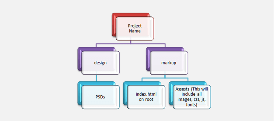
Folder Structure For Word Press

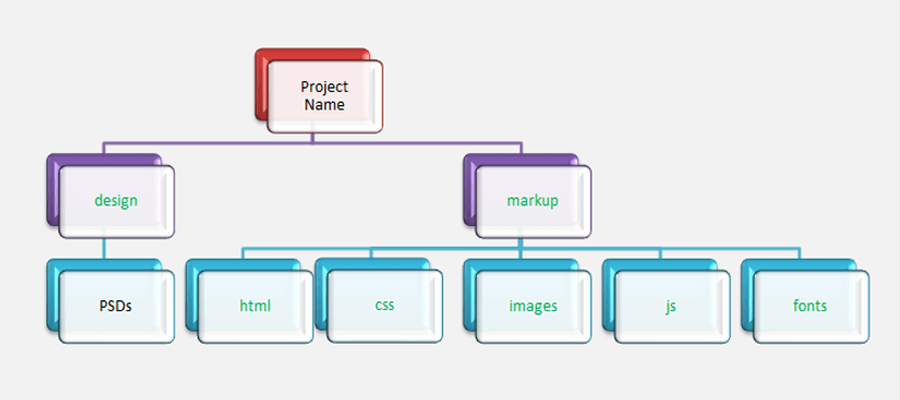
Folder Structure for Shopify
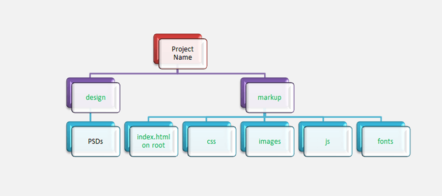
Folder Structure For CrateJoy
Folder Structure For Joomla
Basic structure
First of all, a basic structure must be defined in order to write a clean HTML code. The given code structure is super easy and has been used by top professionals of NYC best PSD to HTML company HTMLPro.net and also by different website development companies around the globe. Here it is:
<div id="wrapper">
     <header id="header">
         <div class="logo">
             <a href="index.html"><img src="images/logo.png" alt=”Logo Text"></a>
         </div>
<nav id="nav" class="open-close">
<a href="#" class="opener"><span></span></a>
<div class="drop">
    <div class="slide">
        <ul>
            <li class="active"><a href="index.html">Home</a></li>
            <li><a href=" about.html "> About Us</a></li>
            <li><a href="#">….</a></li>
							……..
        </ul>
    <div>
</div>
</nav>
</header>
<main id="main" role="main">
    <div id="content">
        <section class="post"></section>
    </div>
<aside id=="sidebar"></aside>
</main>
<footer id="footer">
</footer>
</div>
Code Formatting
Code formatting provides you with numerous opportunities to subtly communicate your purpose to a reader as it is most often reader’s first encounter with your system. So, you should really focus on proper Code Formatting.
Properties Formatting
Padding and margin should also be proper. It is given as follows:
padding: 2px 3px 5px 7px;
Avoid using:
padding-top: 2px;
padding-bottom: 5px;
padding-right: 3px;
padding-left: 7px;
Avoiding Horizontal Scroll
All content of the page should be wrapped in one div like that:
<div id="wrapper"></div>
And the style should be like that:
#wrapper {
overflow: hidden;
width: 100%;
position: relative;
}
This is for avoiding horizontal scroll which appears in browsers.
“Has Layout” Property
If two divs are floating then they must be wrapped in a tag and the tag should have “Has-Layout”. It should have either one of the following functions:
1. Selector
Selector { overflow:hidden; }
2. Selector:after
Selector:after {
content: ”;
display: block;
clear: both;
}
3. Selector
Selector {
display: inline-block;
width: 100%;
}
Also, avoid from clear properties on selector.
Note: Avoid using “Overflow-Hidden” when you realize that content needs to be overflowed. Never use Overflow-Hidden on header and main nav. Instead, you can use any other Has-Layout.
Headings
Use proper Headings in coding e.g H1, H2, H3, H4, H5 and H6 for specific areas keeping in mind that the Heading shows the main info of the block such as title of any content. One more thing there should only be one H1 in one page as per the SEO Standards.
Note: H1 can be used on logo if it is not used in the Design.
Reset CSS
Use “Reset CSS” in your project and customize it according to the current project so that in future if a client adds some text, link, heading etc then it should be in a proper format and according to the theme.
Note: Hover styling should be according to the theme if the client does not shares Hover Effects. Don’t use opacity by default and use revert colors on hover.
Logo Structure
For logo:
And in CSS, it should be like that:
.logo {
float: left; (this propert can be changed according to the structure)
width: 202px;
height: auto;
}
.logo img {
display: block;
width: 100%;
height: auto;
}
Main nav Structure
For top Main Menu:
<nav id="nav">
<ul>
<li><a href="#">Home</a></li>
<li><a href="#">About</a></li>
  .
  .
  .
</ul>
</nav>
For Mobile Menu:
<nav id="nav" class="open-close">
<a href="#" class="opener"><span></span></a>
				<div class="drop">
					<div class="slide">
						<ul>
							<li class="active"><a href="index.html">Home</a></li>
							<li><a href=" about.html ">About Us</a></li>
							<li><a href="#">….</a></li>
							……..
					</ul>
				</div>
			</div>
		</nav>
W3C Validation
The most important thing would be to use valid codes for both HTML and CSS as per the W3C standards and according their website W3
Font-Awesome
Use Font-Awesome instead of icons where needed to get effective results.
Columns Structure
If there are more than one columns in a design, then use this structure:
<div class="two-columns">
	<div class="column">… </div>
	<div class="column">… </div>
</div>
<div class="three-columns">
	<div class="column">… </div>
	<div class="column">… </div>
</div>
Block Quote Structure
Structure for block quote is as follows:
<blockquote>
	<q>comments from any person/company should goes here</q>
	<cite>company/person name should goes here</cite>
</blockquote>
And the Styling should be in Reset CSS.
Date and time Structure
Structure for writing date and time is as follows:
<time> datetime="YYYY-MM-DD Time">DD-MM-YYYY</time>
Image optimization
Optimize all images, so that page load time can be reduced.
For JPEG images
Upload JPEG images one-by-one and download after optimization. This is available online:
http://www.jpegmini.com
For PNG images
You can download this software from here http://pnggauntlet.com to upload all png images and optimize them till 100%.
Social-Networks Structure
For top Main Menu:
<ul class="social-networks">
	<li><a href="#"><i class="fa fa-linkedin-square"></i></a></li>
	<li><a href="#"><i class="fa fa-google-plus"></i></a></li>
.
.
.
</ul>
Use Tags in HTML5
Use logical tags in HTML5 to get appropriated results. Some common HTML5 tags are followings:
<article> Defines an article in the document
<aside> Defines content aside from the page content
<footer> Defines a footer for the document or a section
<header> Defines a header for the document or a section
<main> Defines the main content of a document
<nav> Defines navigation links in the document
<section> Defines a section in the document
<time> Defines date/time
<audio> Defines sound or music content
<video> Defines video or movie content
Break points in responsive
Try to use minimum break points in responsive. Standard break points for custom responsive are following:
@media only screen and (max-width: where content drops) { ……. } if needed.
@media only screen and (max-width: 1023px) { ……. }
@media only screen and (max-width: 991px) { ……. } if needed.
@media only screen and (max-width: 767px) { ……. }
@media only screen and (max-width: 479px) { ……. } if needed.
None-Web Fonts
For non-web fonts, first of all you should search it in Google fonts. If it’s not a Google font, then search in Google and download and generate with font genrator such as https://www.fontsquirrel.com/tools/webfont-generator.
Try different site to generate fonts if they are black listed according to font squirrel.
Note: In @font-face we need to change font-family while in Google fonts, we just need to change font-weight having same font-family.
Id and Class
Class and Id names should be logical as well as short such as banner text caption > caption-holder > caption-frame etc. Also, always use small letters for class, id, images and file name.
CSS Sprite
Always use CSS Sprite for more than one background icons.
Some Important things for Responsiveness
Make sure to add followings for responsiveness:
* { max-height: 1000000px; }
html {
box-sizing: border-box;
-moz-box-sizing: border-box;
-webkit-box-sizing: border-box;
}
body {
min-width: 320px;
-webkit-text-size-adjust: 100%;
-ms-text-size-adjust: none;
}
Some Important things
(a) Use only margin for <p> from bottom and give other properties to the parent <div>.
(b) Use indents like margin/padding to the parent <div> instead of individual tags.
(c) Use proper text-transform property as per design if applicable.
(d) Don’t style child class without parent because if you will use same class multiple times in your project then it will be effected as a whole.
(e) Use alt attribute in img tags. It is necessary for SEO and also don’t leave alt empty. Instead, write there ‘image description’.
e.g. <img src=”images/icon-phone.png” alt=”image description”>
(f) Don’t close single tags with “/ “ in HTML5.
(g) Style drop-down on last child as well.
(h) Use label in form and link with input.
(i) Use input type URL for Website URL.
(j) After and before does not work in form elements such as input type text, input type search, input type submit, select etc. So, use button type submit.
(k) Use class search on input type search because it doesn’t work in IE9.
(l) Home page name should be index.html.
(m) Don’t use so much important styling.
(n) ID has more importance in CSS than Class.
(o) To check web in devices, use these to links: http://mobiletest.me and http://www.responsinator.com/
(p) Install web developer toolbar. It’s very useful for developer i.e to check responsiveness on different screen resolutions http://prntscr.com/czleu2
Some tips for SEO
(a) Don’t use inline or internal CSS.
(b) Use logical tags in HTML5.
(c) Don’t close single tags with “ / ” in HTML5.
(d) Use alt attribute in img tags it’s necessary for SEO and don’t leave alt empty, write here ‘image description’. e.g. <img src=”images/icon-phone.png” alt=”image description”>
(e) Don’t use long name for ID and Class.
(f) Include minimum CSS files. We can import other CSS files in one CSS file such as http://prntscr.com/cx2ft2
(g) Include minimum JS files.
(h) Try to use minimum break points in responsive.
So, guys, these were the most common and useful tips every front-end developer must try.
At HTMLPro.net, our professional HTML Developers focus on standardized set of structure and tend to follow standardized code.
